DemocracyLab - Creating Impact
UI Accessibility | Data Visualization | Information Design
Proposing an impact dashboard that invites donations and increases volunteer influx through showcase of value created while ensuring information clarity and accessibility.

Target Audience
Donors and volunteers that actively participate with DemocracyLab. Phase 1 specifically targets an accessible foundation for the donor demographic.
Project Focus
UI Accessibility, Data Visualization, Information Design and Visual Design
Goal
Design an MVP for the impact dashboard that serves as a metric guide for donors to view and also donate to the platform. Ensure it's accessible and expandable to accommodate further feature propositions in upcoming phases.
Responsibilities
Led the design decisions behind this project, enhanced the design system for DemocracyLab to allow accessible elements to utilize in this project and beyond.
Click here for final designs!
Project Scope and Goals
Setting the stage for the design process
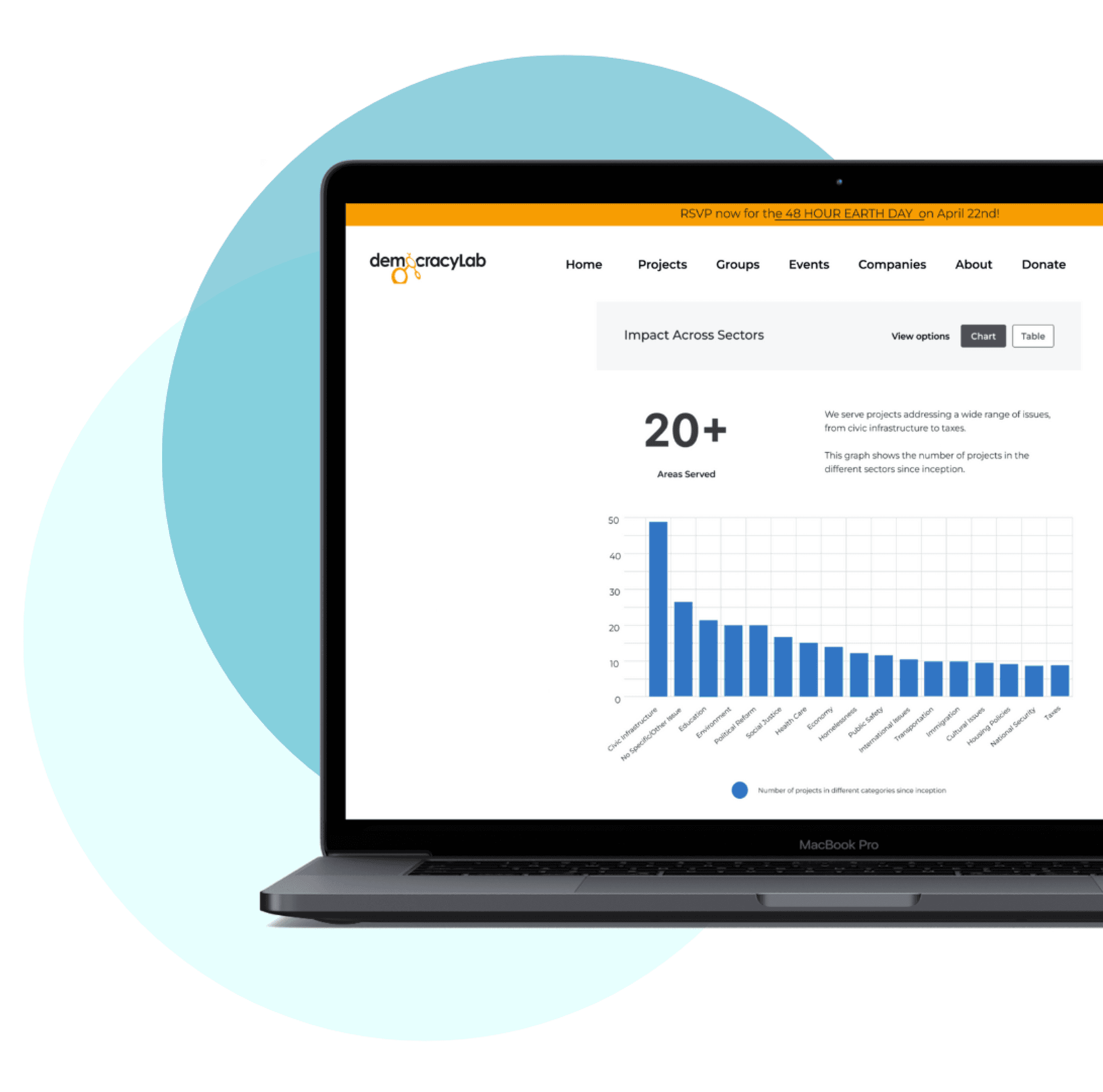
This page aims to be a guide for donors and volunteers alike, that encourages their support through donations and skills. This is an MVP design targeting the donor demographic in particular, which gave the team a limited set of data to work with initially to get the product up and running - this would then be tested and developed while the design team moves into phase 2. Additionally, there were added limitations in terms of what data was readily available to present through the dashboard - I made it a priority to carefully highlight pertinent information in a quickly digestible format to enhance incoming donations.
Phase 1 main goal: To display relevant impact metrics to donors in order to incentivize them to donate through the platform.
Accessibility Highlights
Issues with the current design system
One of the biggest focuses of this design is on accessibility, and I wanted to make sure our designs followed the 3:1 contrast ratio and were keyboard and screen-reader friendly. A major drawback of the current design system is the lack of accessible colors for visual elements like graphs - I also took upon the task to update the DS and include elements required for this design and future DemocracyLab work. I highlighted the following requirements throughout my design:
1.4.3 Contrast (Minimum) - the minimum contrast ratio is 4.5:1.
1.4.1 Use of Color - Color is not the only visual means used to convey information or elicit action from the user.
2.1.1 Keyboard - All functionality of the content is operable through a keyboard interface without requiring specific timings for individual keystrokes.

Color and Fonts
A clear direction for visuals
Being a graph-heavy dashboard, it needed colors that are bold to match the aesthetic of the website but those that are also high-contrast against a white background. For font, I chose Montserrat to stay consistent with the design system of DemocracyLab - but no text is smaller than 10px (captions and legends) to ensure readability. These designs are also scalable - so even with any settings that size up fonts, the content is still understandable. Aside from keyboard and screen-reader accessibility, I wanted to ensure clear visual hierarchy so that the page is scannable through headers. Additionally I also wanted to explore options that would allow users to absorb graph data in ways other than just through the visual elements.
Design Process
Highlighted key features
Reducing dependance on visual representation
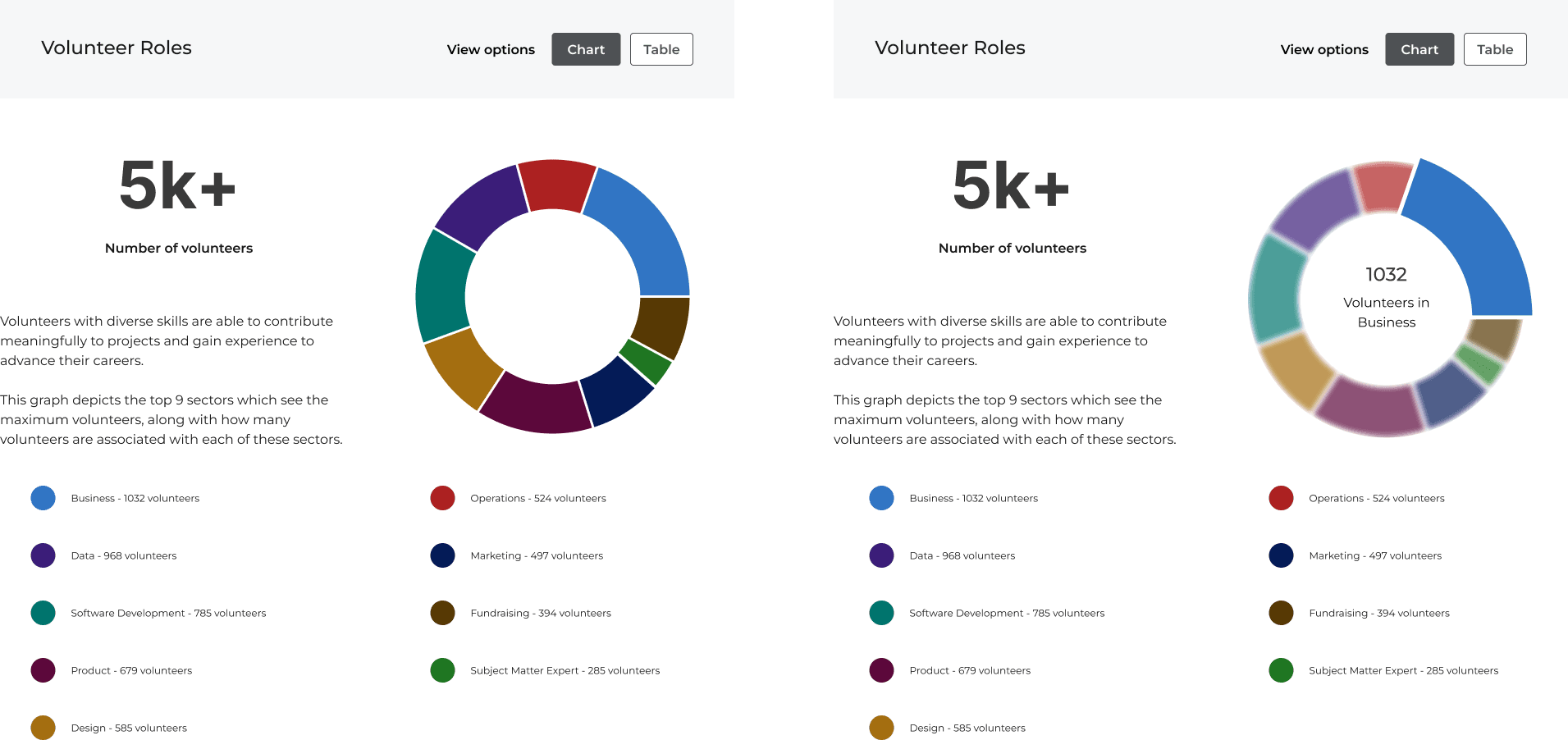
I created an alternative tabular form for every graphical data displayed, which would be significantly easier to go through for screen-reader users and also satisfies 1.4.1 Use of Color, as the graphs heavily rely on color to relay information. This provides a color-exempt alternative for that purpose.
The toggle buttons to switch between these views are readily accessible near the graph header.

Information hierarchy for keyboard scannability
The dashboard has a clear and visible header, and each graph has its own header which clearly conveys its purpose. Following this is the main takeaway from the graph, along with a brief explanation as to what the graph showcases. This is to ensure a keyboard and screen-reader friendly interface.
I ensured organization by relevancy and importance, so as to enable the user to quickly scan the purpose and summary of the data presented to them. The red arrows indicate the order of screen-reader functionality.

Compensating for mouse-based actions
I ran into some roadblocks when visualizing data using donut charts - because it required to use up only a small portion of the screen, adding textual information to it would cause content overcrowding within the graph. So I proposed a on-hover feature where the user can mouse over the chart sections which reveals more details. This becomes an issue when considering mouse-free use - so to ensure accessibility I added all relevant data to the graph legend apart from the tabular format.

Final Walkthrough
Presenting the finalized dashboard design
The data is preceded by a call for donations and volunteers to loop in those interested in being a part of the community or just supporting DemocracyLab overall.
Upcoming Work
Expanding into volunteer - focused features
The next phase (currently ongoing) is a deep dive into how volunteers can view, process and track the impact they have created through their contributions. This is a feature driven, interactive module as opposed to information relay as in the MVP.

